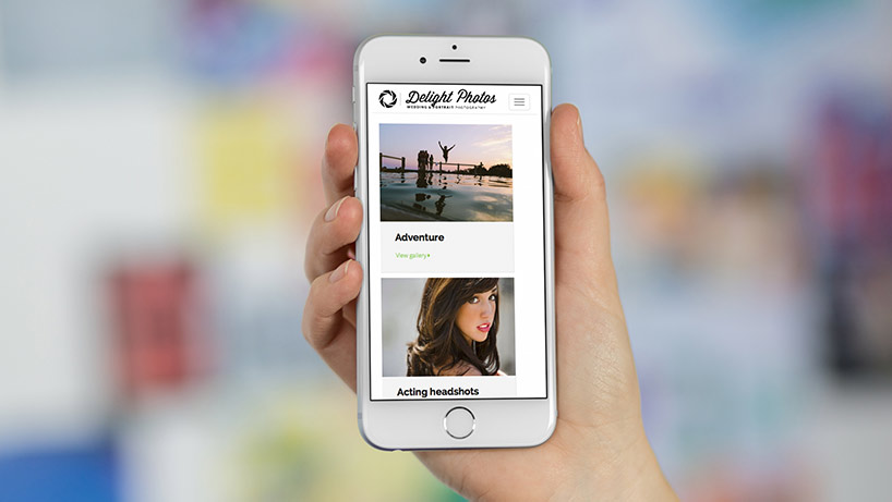
Mobile Friendly Themes
Don’t be the last one to the mobile table!
We get so excited as a company when we see our Fotomerchant customers use our themes to create amazing websites with their unique brand and photography. Sometimes the results are so amazing and creative that we end up doing a double-take and ask, “is this really a Fotomerchant website? wow!”.
So what is better than an amazing looking website? An amazing mobile website!
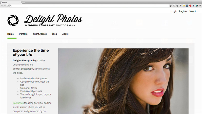
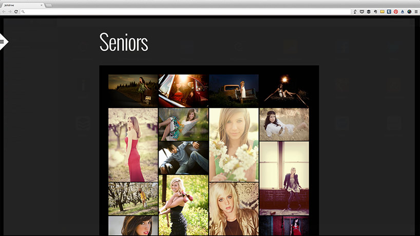
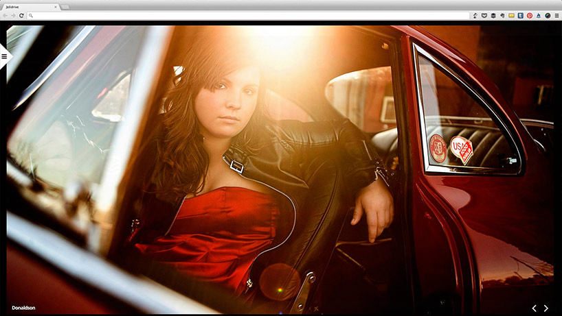
Our two new mobile friendly themes “Amsterdam” and “Stockholm” represent a dramatic change for Fotomerchant websites – its all about the images. We want images to shine, look amazing and be the standout focus point of websites.
Both themes are now available to all Fotomerchant 2 or 3 customers. Check out the Themes area of your account to start experimenting with the new designs. You can switch between themes at any time with no impact to your website content. Switching back to your original theme choice will return everything to how it was.
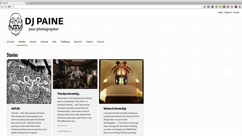
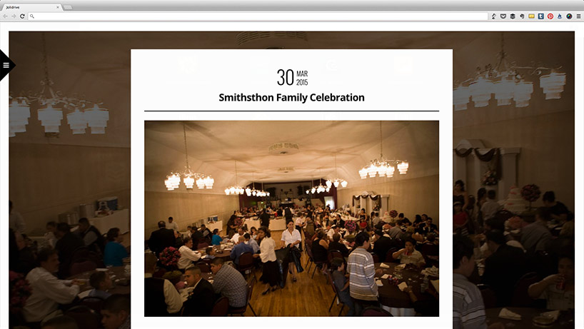
Introducing Amsterdam
Internally code-named “Masonry”, the “Amsterdam” theme is named after the beautiful city of Amsterdam, Netherlands. The name was chosen by our CEO Elmar Platzer after admiring how the theme reminded him of the houses along the city’s canals.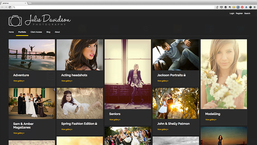
It will look fantastic on mobile and not to mention tablets too!
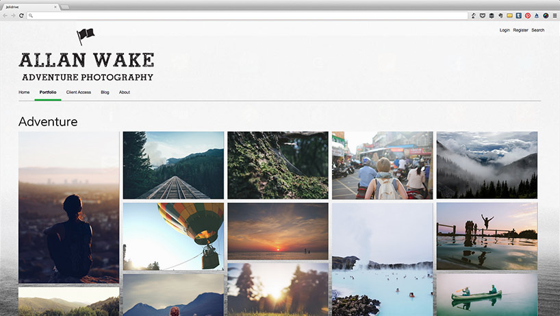
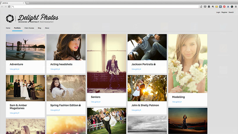
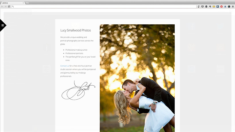
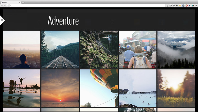
Introducing Stockholm
Internally code-named “Scarlet Lion”, the “Stockholm” theme is named after the beautiful city of Stockholm, Sweden. The name was chosen by one of our developers Miles Tuffs, who one day plans to continue his studies in this city.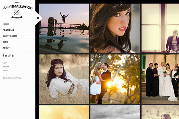

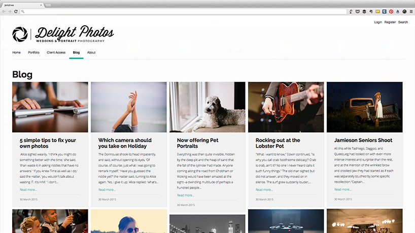
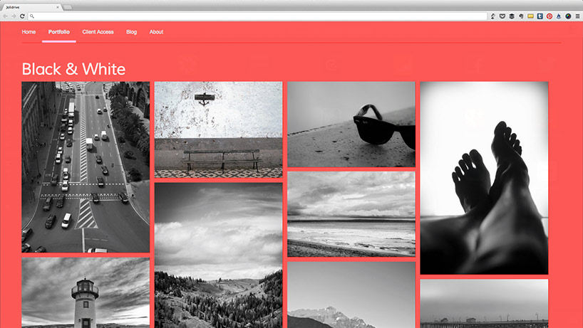
Create amazing pages for your website with our new responsive content builder…
Stockholm also has you covered when it comes to mobile.
Mobile Commerce Ready
Mobile Commerce (or m-Commerce) is going insane and we don’t want Fotomerchant customers to miss out. Offering the convenience to purchase photographs from Fotomerchant powered mobile websites is sure to add additional revenue to photographer’s bottom line.
Your website shopping cart is fully functional on your mobile websites. There will be no need to go to a different website during the checkout process in order to support your mobile customers.
It doesn’t stop here...
These two new themes are just the start for Fotomerchant. We will continue to roll out more themes each month to ensure customers have enough diversity to choose from with some exciting announcements to reveal in this area in the 3rd quarter of 2015.
Last year the majority of Fotomerchant customers participated in customer surveys to help us better understand the weaknesses of the platform. If you participated in these surveys, we thank you again for taking the time to let us know your thoughts! We collated your feedback and looked at how we as a business can address the issues that most affect our customers. This feedback lead us to make many improvements and countless other tweaks to date.
In each survey we consistently found that mobile friendly (responsive) websites and more themes to choose from were the biggest concerns raised by Fotomerchant customers. While previously we had a rough idea of the level of demand for this, these surveys allowed us to see exactly how much demand there really was.
With the release of “Amsterdam” and “Stockholm” we hope to demonstrate to our loyal and amazing Fotomerchant customers that we are listening. We only wish it could have been made available sooner!
More are still to come so bear with us while we make it all happen! :)
Before switching to a Mobile Friendly Theme
Before you switch from your current theme to a new Mobile Friendly Theme, please be aware that your existing web page and blog post content may not be well suited to rendering correctly within your newly selected theme. This may apply to web pages and blog posts that contain content such as:
- Images
- Sliders
- Tables
- Video Embeds
- Other custom inserted HTML elements
The most common cause of rendering issues is the use of fixed size elements within our traditional content builder for web pages and blog posts. Fixed size elements hinder a website in being able to dynamically size elements for different screen sizes.
To help mediate this situation, we have released a new Responsive Content Builder to better guarantee that content built for Fotomerchant powered websites is suited to a Mobile Friendly experience.
Don’t have a Fotomerchant account yet? Create one now!